Greybeards rise
How a vim colorscheme changed my desktop
TL;DR
Twenty years of desktop environments — WindowMaker, KDE3, fvwm, i3 — and the lesson is always the same: consistency beats aesthetics. This is how I took one vim colorscheme (iceberg) and spread it across my entire desktop: terminal, prompt, window manager, launcher, screensaver, and even git. One palette aligns the whole UI. The only constraint you lay on yourself: timebox it. Because theming takes a fuck-ton of time.
Iceberg ahead
I’m no ricer by any means. But I can tell you my process. Nothing is planned, but everything I did, I did with a masterplan.
My vim color theme for years has been monokai, but I felt that I needed
something else. I went looking and came across
iceberg made by cocopon
. What I found
interesting was that cocopon gave a talk about themes on vimconf 2017 on how to
create your own color scheme
.
I read it and something clicked. The take home concept is that you pick base
colors and instead of picking different colors you look for a “family” of
colors on the lighter and darker side of it to create your theme. You pick a
shade of blue and you then look at both the darker and lighter spectrum of that
blue to create a consistent color theme. And you do this for all of the colors
you pick.
I have a forked version of cocopons’ iceberg theme because of a bug and there is no sign that they are going to merge the fix I send them . I also stripped all the light theme support and the neovim from it, because if you fork it, why not strip it to the bare essentials of what you actually need and use :)
Color coding
When I read how cocopon approached theming I decided to make a plunge: unify
the whole desktop experience to one single theme. Kitty (my terminal) was next
up: how would this have to look. And while I started with kitty I quickly found
out that someone else did the hard work for
me
.
So, I used their implementation. For my zsh prompt I quickly looked at
alternatives for blue, green and red, and these became: #3E445E
, #B4BE82
, and #85512c
for when I’m root.
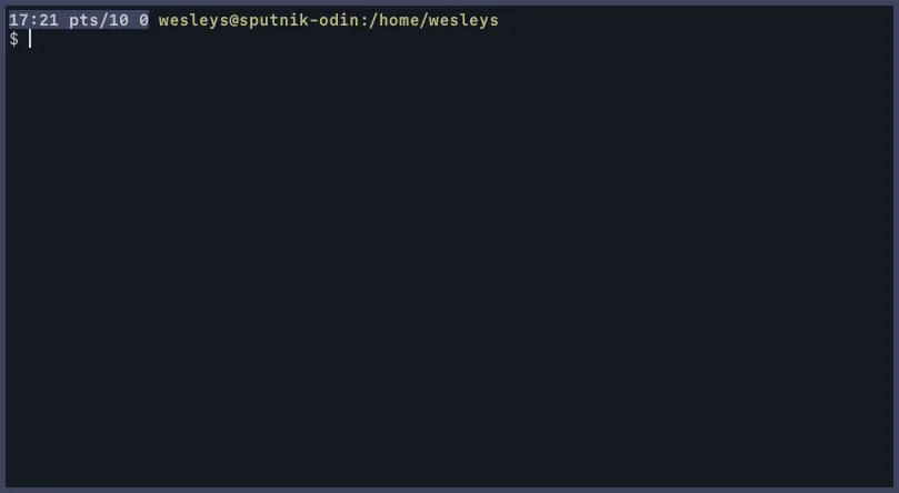
Local:
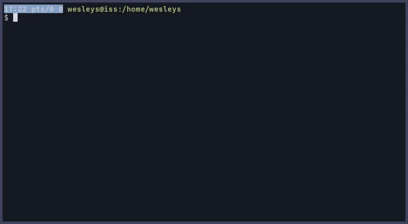
Over ssh (without sendenv/acceptenv):
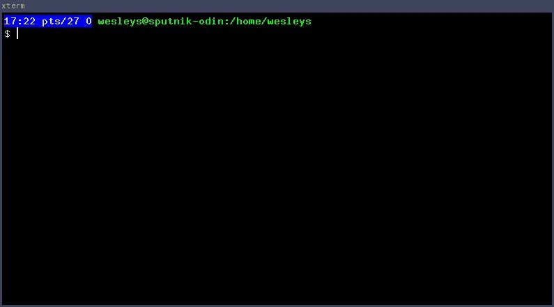
And xterm
And urxvt
iii
Changing my i3 was up next. i3 doesn’t have a lot to tweak. It’s a tiling window manager and it’s pretty bare-bones. But it also has a status bar, so we could do some tweaking so my whole screen looks coherent.
The i3 bar uses a dark background (#272C42
) with light text
(#F8F8F2
). The focused workspace - the one you’re currently on
- gets highlighted with that iceberg green (#B4BE82
) so it
stands out. Inactive workspaces fade into the muted gray (#6B7089
) so they’re visible but don’t compete for attention.
It’s all about visual hierarchy using the same color family. Active things are green, inactive things are gray, backgrounds are dark. Your eye immediately knows what’s important without thinking about it.
Applying this to windows follows the same logic. For those unfamiliar with i3: i3 organizes windows into containers, which can be split horizontally or vertically, stacked, or tabbed - like browser tabs but for any application. This container system means i3 needs to style multiple states:
- Focused: The window you’re typing in gets green text
#B4BE82and a purple-gray border#3E445E - Focused inactive: A window that’s “selected” in its container (like the
active tab) but you’re working elsewhere - gets blue-ish text
#84A0C6 - Unfocused: Everything else fades to gray
#6B7089 - Urgent: Notifications get a red indicator
#FF5555 - Background: Everything sits on dark
#161821
Active

Inactive

The same color hierarchy: active things are bright and colorful, inactive things fade to gray.
i3 config section
# Start i3bar to display a workspace bar (plus the system information i2status
# finds out, if available)
bar {
  position top
  # top right bottom left
  #padding 5px 5px 5px 5px
  separator_symbol "𐄁"

  status_command i3status

  font pango:CommitMono Regular 8
  colors {
    # See rofi/waterkip.rasi for color codes
    # visual: #272C42
    # tabLine: #3E445E
    # modeMsg: #6B7089

    background #272C42
    statusline #F8F8F2
    separator  #6B7089

    # whati            border  bg      text
    focused_workspace  #161821 #B4BE82 #000000
    active_workspace   #161821 #161821 #B4BE82
    inactive_workspace #161821 #161821 #6B7089
    urgent_workspace   #161821 #161821 #6B7089
    binding_mode       #161821 #161821 #6B7089
  }
}

# This defines colors for "clients", aka the actual windows
# class                 border  backgr. text    indicator child_border
client.focused          #3E445E #3E445E #B4BE82 #6272A4  #3E445E
client.focused_inactive #161821 #161821 #84A0C6 #44475A  #161821
client.unfocused        #161821 #161821 #6B7089 #282A36  #161821
client.urgent           #161821 #161821 #6B7089 #FF5555  #161821
client.placeholder      #161821 #161821 #6B7089 #282A36  #161821
client.background       #161821
dmenu.suckless and rofi
I3 uses dmenu, which is provided by suckless (from dwm). I replaced dmenu with rofi. It behaves like dmenu but is fully themeable. It provides a dropin replacement for dmenu, so the transition from dmenu to rofi is painless.
With some Debian-foo called update-alternatives I replaced suckless'
implementation of dmenu with rofi. I installed rofi and renamed dmenu from
suckless to dmenu.suckless including the manpage. And rofi now is the binary
called dmenu.
Ansible configuration for Debian's update alternative configuration
And because I use ansible, here you can see the playbook contents:
- name: Divert dmenu from suckless-tools
  become: true
  community.general.dpkg_divert:
    path: /usr/bin/dmenu
    divert: /usr/bin/dmenu.suckless
    rename: yes
    state: present

- name: Divert dmenu manpage from suckless-tools
  become: true
  community.general.dpkg_divert:
    path: /usr/share/man/man1/dmenu.1.gz
    divert: /usr/share/man/man1/dmenu.suckless.1.gz
    rename: yes
    state: present
I’m doing this because now I can create an update-alternatives group for dmenu:
- name: update-alternative for dmenu from suckless-tools
  become: true
  community.general.alternatives:
    link: /usr/bin/dmenu
    name: dmenu
    path: /usr/bin/dmenu.suckless
    priority: 20
    state: auto
    subcommands:
      - link: /usr/share/man/man1/dmenu.1.gz
        name: dmenu.1.gz
        path: /usr/share/man/man1/dmenu.suckless.1.gz

- name: update-alternative for dmenu from rofi
  become: true
  community.general.alternatives:
    link: /usr/bin/dmenu
    name: dmenu
    path: /usr/bin/rofi
    priority: 50
    state: auto
    subcommands:
      - link: /usr/share/man/man1/dmenu.1.gz
        name: dmenu.1.gz
        path: /usr/share/man/man5/rofi-dmenu.5.gz
Rofi by default looks.. It has a paper beige like color and its.. something, let me put it that way. But it allows for CSS like styling which is awesomesauce.
Rofi
waterkip.rofi
* {
    spacing: 2;

    normalBg:   #161821;
    normalFg:   #C6C8D1;

    comment:    #6B7089;
    function:   #84A0C6;
    identifier: #89B8C2;
    include:    #84A0C6;
    modeMsg:    #6B7089;
    nonText:    #A093C7;
    preproc:    #B4BE82;
    visual:     #272C42;
    tabLine:    #3E445E;
    title:      #E2A478;
    todoBg:     #45493E;
    todoFg:     var(preproc);

    separatorcolor: var(modeMsg);

    background: var(normalBg);
    foreground: var(normalFg);

    background-color: var(background);
    foreground-color: var(foreground);

    urgent-background: var(background);
    urgent-foreground: var(foreground);
    alternate-urgent-background: var(urgent-background);
    alternate-urgent-foreground: var(urgent-foreground);

    normal-background: var(background);
    normal-foreground: var(foreground);
    alternate-normal-background: var(normal-background);
    alternate-normal-foreground: var(normal-foreground);

    // Current selection
    selected-normal-background:  var(visual);
    selected-normal-foreground:  var(function);

    active-background: var(visual);
    active-foreground: var(nonText);
    alternate-active-background: var(active-background);
    alternate-active-foreground: var(active-foreground);

    selected-active-background: var(tabLine);
    selected-active-foreground: var(preproc);

    selected-urgent-background:  var(background);
    selected-urgent-foreground:  var(foreground);
}

window {

  anchor: center;
  width:  30%;
  height: 50%;
  margin: 2px;
  padding: 2px;
  spacing: 0px;

  background-color: @background;
  border-color: @foreground;

  // Fake transparancy by creating a screenshot so our borders work
  // breaks when using this on top of a video, but /care, we don't need a
  // compositor for this, so that's a win.
  transparency: "screenshot";
  border-radius: 10px 10px 10px 10px;
  border: 4px;

  scrollbar: false;
}

mainbox {
    border:  0;
    padding: 0;
}

message {
    border:       1px dash 0px 0px ;
    border-color: @separatorcolor;
    padding:      1px ;
}

textbox {
  text-color: @foreground;
}

listview {
    fixed-height: 0;
    border:       2px dash 0px 0px ;
    border-color: @separatorcolor;
    spacing:      2px ;
    padding:      2px 0px 0px ;
}
element {
    border:  0;
    padding: 1px ;
}
element-text {
    background-color: inherit;
    text-color:       inherit;
}

element normal.normal {
    background-color: @normal-background;
    text-color:       @normal-foreground;
}
element.normal.urgent {
    background-color: @urgent-background;
    text-color:       @urgent-foreground;
}
element.normal.active {
    background-color: @active-background;
    text-color:       @active-foreground;
}
element.selected.normal {
    background-color: @selected-normal-background;
    text-color:       @selected-normal-foreground;
}
element.selected.urgent {
    background-color: @selected-urgent-background;
    text-color:       @selected-urgent-foreground;
}
element.selected.active {
    background-color: @selected-active-background;
    text-color:       @selected-active-foreground;
}
element.alternate.normal {
    background-color: @alternate-normal-background;
    text-color:       @alternate-normal-foreground;
}
element.alternate.urgent {
    background-color: @alternate-urgent-background;
    text-color:       @alternate-urgent-foreground;
}
element.alternate.active {
    background-color: @alternate-active-background;
    text-color:       @alternate-active-foreground;
}

scrollbar {
    border:       0;
    handle-width: 8px ;
    handle-color: @visual;
}

mode-switcher {
    border:       2px dash 0px 0px ;
    border-color: @separatorcolor;
}

button.selected {
    background-color: @selected-normal-background;
    text-color:       @selected-normal-foreground;
}

inputbar {
    spacing:    0;
    text-color: @normal-foreground;
    padding:    1px ;
    children:   [ prompt,textbox-prompt-colon,entry,case-indicator ];
}

case-indicator {
    spacing:    0;
    text-color: @normal-foreground;
}

entry {
    spacing:    0;
    text-color: @normal-foreground;
}

prompt {
    spacing:    0;
    text-color: @normal-foreground;
}

textbox-prompt-colon {
    expand:     false;
    str:        ":";
    margin:     0px 0.3em 0em 0em ;
    text-color: @normal-foreground;
}
Non-theming things in i3
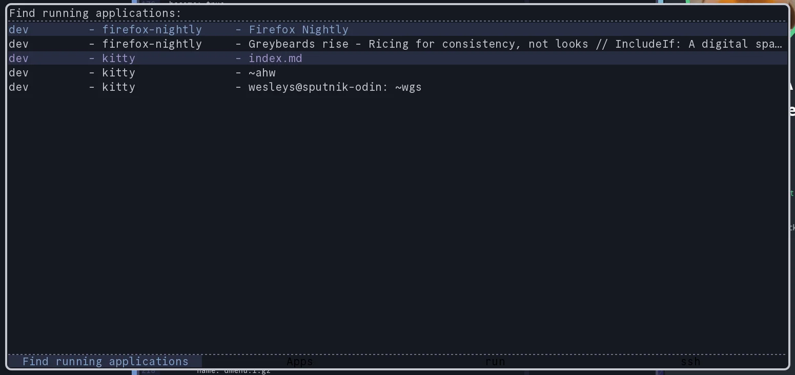
There is one really big thing I have that has nothing to do with theming and that is what I call dynamic workspaces, or context aware workspaces. I’ve been told it is similar to KDE Activities. You can read all about it in the blog post Workspace on Demand in i3wm . But the short intro is: I have workspace groups (or contexts, or activities) and these groups can have predefined layouts and when I switch to a workspace it automatically starts up applications based on the layout. I build it on top of i3’s IPC events.
The fun thing here is that when I start my terminal (kitty) in a context, it
automatically starts in a specific directory. It makes use of the X11 root
window properties set by my workspace daemon which can be extracted via
xprop. A pretty clever hack iyam. The same hack powers a small unit in my i3
bar that tells me which context I’m currently on (including the workspace).
kitty
#!/usr/bin/env zsh

source $HOME/.zsh/autoloadrc
source $HOME/.zsh/nameddirrc
source $HOME/.env.local

group=$(i3-wod-current-group)
ws=$(i3-wod-current-workspace)

if [ $ws = 'area51' ]
then
  exec /usr/bin/kitty
  return
fi

case $group in
  hiwinds) target=~ahw;;
  opndev) target=~opndev;;
  bta) target=~bta;;
esac

exec /usr/bin/kitty $target
In a similar fashion. When using newsboat I also look for a browser in the current workspace. If it exists I activate it and than send the URL it so it opens. If I can’t find a browser it starts logic to find the default browser and opens the browser with the URL.
Newsboat
#!/usr/bin/env zsh

[ -z "$1" ] && echo "Provide a URI" >&2 && exit 1

fpath=(~/.zsh/autoload/i3 $fpath) && autoload i3-wod-current-workspace

ws=$(i3-wod-current-workspace)

#echo "Checking workspace $ws"

browser_id=$(i3-msg -t get_tree | jq ".. | objects | select(.name? == \"$ws\") | .. | objects | select(.window_properties?.window_role? == \"browser\") | .window" | head -1)

if [ -z $browser_id ]
then
  default_browser=$(xdg-settings get default-web-browser)
  p=$(find ~/.local/share/applications /usr/share/applications -name $default_browser)

  autoload regexp-replace
  bin=$(grep Exec $p)
  regexp-replace bin ' %u' ""
  regexp-replace bin 'Exec=' ""
  #echo "Opening new browser $bin in $ws"
  i3-msg exec "$bin --new-window $*"
  return
fi

class=$(xprop -id $browser_id WM_CLASS | awk -F, '{print $NF}' | tr -d '"' | tr -d ' ')
#echo "Opening new browser $class in $ws on $browser_id"
xdotool windowactivate $browser_id
exec $class "$*"
Old X11 applications get loving too
To create consistency across the board I also decided to theme my screensaver,
which is xscreensaver. It must be configured via your .Xresources. Another
application that must be configured via this file is ssh-askpass. The only
problem is, that I was unable to set a nice TrueType font so I had to go with
Helvetica bold, which is an X11 bitmap font. The colors are there, the font is
still… up for improvement: if you know a better font or know how to change
this to TrueType: Hit me up!
Text uses #84A0C6
and the background is a dark blue #161821
. And I added some green to break the (dark) blue a bit #B4BE82
, and for ssh-askpass I added the orange-y #E2A478
as a text color for the cancel button to signal “scary” action.
In reality ssh-askpass is one of the latest themed things in my universe. I don’t see it that often, so it lagged behind a little.
.Xresources
! The defaults are True
!*passwd.uname: False
!*passwd.asterisks: False
xscreensaver.splash: false

! Set to nothing makes user switching not possible
*.newLoginCommand:

*default.Dialog.background: #161821
*default.Dialog.foreground: #84A0C6

*default.Dialog.text.background: #242940
*default.Dialog.text.foreground: #84A0C6

*default.Dialog.button.background: #242940
*default.Dialog.button.foreground: #84A0C6

*default.Dialog.borderColor: #D2D4DE
*default.Dialog.borderWidth: 0

*default.Dialog.thermometer.background: #242940
*default.Dialog.thermometer.foreground: #B4BE82
*default.Dialog.thermometer.width: 10

! Could go for 0 too if honest
*default.Dialog.shadowWidth: 2

*default.Dialog.logo.background: #242940
*default.Dialog.error.foreground: #E2A478

*default.Dialog.topShadowColor: #3E445E
*default.Dialog.bottomShadowColor: #3E445E

! TODO: Figure out how to change the logo
! The logo is hardcoded or perhaps..
! /usr/share/pixmaps/xscreensaver.png
! /usr/share/pixmaps/xscreensaver.svg
!*default.Dialog.logo.width: 210
!*default.Dialog.logo.height: 210
*default.Dialog.internalPadding: 30

*dateFormat: %Y-%m-%d %H:%M
! Upstream thinks this is cool, but it isnt
*grabDesktopImages: False

!*Dialog.headingFont:	sans-serif bold 16
!*Dialog.errorFont:	sans-serif bold 14
!*Dialog.labelFont:	sans-serif bold 14
!*Dialog.unameFont:	sans-serif 12
!*Dialog.buttonFont:	sans-serif bold 14
!*Dialog.dateFont:	sans-serif 9
!*Dialog.bodyFont: Inter Display 20


SshAskpass*background: #161821
SshAskpass*foreground: #84A0C6

SshAskpass.Dialog.background: #161821
SshAskpass.Dialog.foreground: #84A0C6

SshAskpass*Button.background: #242940
SshAskpass*Button.foreground: #84A0C6

SshAskpass*cancel.background: #242940
SshAskpass*cancel.foreground: #E2A478

SshAskpass*cancelButton.background: #242940
SshAskpass*cancelButton.foreground: #E2A478

SshAskpass*Indicator.foreground: #B4BE82
SshAskpass*Indicator.background: #242940

SshAskpass*borderColor: #D2D4DE
SshAskpass*borderWidth: 0
SshAskpass*shadowWidth: 2
SshAskpass*topShadowColor: #3E445E
SshAskpass*bottomShadowColor: #3E445E

SshAskpass*font: -*-helvetica-bold-r-*-*-21-*-*-*-*-*-*-*
Other applications
One of the things I also themed was git. And you might be surprised how well
git is themeable. You can colorize diff, branch, status, and decorate.
You are seemingly a bit constrained in which colors you can pick, but with some
trial and error I managed to get most things in line with my theme. You have
some modifiers to make colors popup (bold) or dim (dim). This allows you to
play a bit with how you present things.
Seemingly? You can go nuts if you use hex colorcodes, which git also supports, the limitation is mostly your terminal emulator. This way you can theme git in exactly the same style as your theme. There is a fun caveat, or “caveat” (emphasis mine), it’s something you can use and abuse. In kitty for example you can tell the terminal what your red must look like. So for example if one is color blind, you can take these optimized colors for blue, red, yellow, and green. I took this example from a CSS system I’m building, hence the info/success/warn/error notations:
- info (blue):
#2f6fed - success (green):
#0f766e - warn (yellow):
#d97706 - error (red):
#b91c1c
So we have these colors defined in kitty to tell it, use these values as these
colors. Now git will happily show you #d97706
as yellow. So
your terminal configuration dictates your gitconfig. Which means, git can lean
on that configuration and a change in kitty, changes the way git looks! Free
inheritance!
.gitconfig color sections
[color]
  # Possible colors are:
  # black, red, green, yellow, blue, magenta, cyan, white and default.
  # This depends on your terminal tho.
  # Also supported are ansi 256 colors
  # And 24bit aka hex
  ui = auto
  advice = never

[color "branch"]
  current = green
  local   = yellow
  remote  = yellow reverse
  # Or hex
  current  = "#89B8C2"
  local  = "#E2A478"
  remote  = "#E2A478" reverse

[color "diff"]
  meta   = yellow bold
  frag   = magenta bold
  old    = yellow dim
  new    = green dim
  commit = green

[color "status"]
  added     = green
  changed   = yellow dim
  untracked = white dim
  branch    = blue
  remoteBranch = yellow dim
  localBranch = yellow dim

[color "decorate"]
  # branch, remoteBranch, tag, stash or HEAD for local branches,
  # remote-tracking branches, tags, stash and HEAD,
  # respectively and grafted for grafted commits.
  branch       = blue
  remoteBranch = yellow dim
  tag          = magenta
  stash        = blue
  HEAD         = blue
I also configured tig to be sort of compliant with my theme. But I don’t use
it that much and it has also limited color support from the last time I tried
to theme it. I do see they read colors from git’s config, ymmv.
.tigrc color
# This is a nice view with the branching readable and inspectable
set main-view = \
    date author:abbreviated,width:10 \
    id:1,width:0 \
    commit-title:graph:v2,overflow:1

set tree-view = \
    line-number:no mode \
    id:yes,width:6 \
    date:default \
    file-size:units \
    file-name:always,width:0

# https://jonas.github.io/tig/doc/tigrc.5.html
# Color command > UI colors
#       area                fg    bg      attriutes
color   cursor              252   237
color   title-focus         237   magenta
color   title-blur          237   magenta reverse
color   file                237   252

# files in the diff stats
color   diff-stat           252   default
color   "Signed-off-by:"    white   default
color   "Signed-off-by"     white   default
Iteration is key
Why do I say iteration? Well, because I look at tweaking your environment not as a single day exercise. That has two reasons:
- Theming is a huge time sink. You need to timebox your efforts.
- Theming is a huge time sink. You really need to timebox your efforts.
And for myself, things that are still open? I have some GTK themes that look like iceberg, but I do want to end up at something consistent so I have Firefox, Thunderbird and Chrome running the same theme. The biggest thing is going to be to support a light theme for some work related mail and browsers. For which I need to have a look again at the light theme from cocopon which I stripped from my own fork (I can feel the irony while typing this).
But honestly, I really want to change my grub and my lightdm to be in the same style. Much more nerdy to change than GTK I think. When I do: expect an update!